SUSE is a global leader in innovative, reliable, secure enterprise-grade open source solutions, relied upon by more than 60% of the Fortune 500 to power their mission-critical workloads. We specialize in Business-critical Linux, Enterprise Container Management and Edge solutions, and collaborate with partners and communities to empower our customers to innovate everywhere – from the data center, to the cloud, to the edge and beyond.
The previous SUSE branding had a memorable quality from the intuitive logo of the chameleon shape. However, the intricate design presented challenges in terms of versatility, particularly when downsizing for mobile graphics and adapting it to various application designs.
Approach
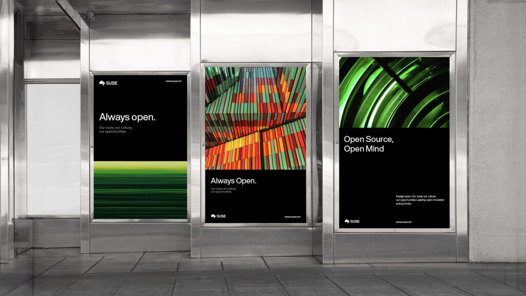
Hae set out to develop a new SUSE brand identity that could effectively communicate across diverse media channels. The objective was to enhance flexibility, ensuring the brand could seamlessly integrate into various applications, ultimately serving as a powerful tool for promoting the company.
Our role
Strategy
Project management UX strategy Brand strategy Market research